
Forecasts by the US Federal Reserve (Fed) for inflation and growth are central to what markets expect the course of policy rates to be. Together, their projections form the Fed’s ‘dot plot’. In addition to forecasts on growth, the unemployment rate and inflation, each (voting and non-voting) member of the policymaking Federal Open Market Committee (FOMC) provides their assessments of appropriate policy.
The FOMC began publishing the dots in 2012, when Ben Bernanke was the Fed chair.
It probably was not the original purpose, but the median point of projections (see Exhibit 1) is seen more and more in markets as forward guidance for the pace of policy rates, without considering the considerable uncertainty around these projections.
Readers should note that the seven-member Fed Board of Governors in Washington and each of the 12 regional Federal Reserve banks have their own researchers using different forecasting models as explained in this article.
The dot plot then is not a consensus view from the Fed or a staff forecast (as it is at the ECB) – it is just a collection of different forecasts.
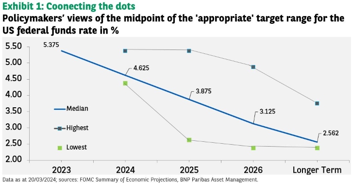
The March ‘dot plot’ suggests three US rate cuts in 2024 and has come as a relief to some market observers who had worried that there would be only two cuts after recent strong inflation data.
But forward guidance – gazing into the crystal ball – is not an easy game. And without an appropriate tool, it is even trickier.
Disclaimer


